Ed Nisley's Blog: Shop notes, electronics, firmware, machinery, 3D printing, laser cuttery, and curiosities. Contents: 100% human thinking, 0% AI slop.
Category: Science
If you measure something often enough, it becomes science
Back in the beginning of July, I replaced the NP-BX1 battery in the RGB Piranha astable multivibrator with a 18650 lithium cell and a USB charge controller, then watched it blink for the next two weeks on the first charge:
Astable – 10 11 12 uF tweak – 027
However, the blinks looked … odd and some poking around with a Tek current probe showed the red and blue astables had locked together, so they blinked in quick succession. Alas, I don’t have a scope shot to prove it.
I built all three astables with the same parts, figuring the normal tolerance of electrolytic caps would make the astables run at slightly different rates, which they did at first.
This being a prototype, I just soldered a 1 µF cap onto the blue channel’s existing 10 µF cap:
Astable – 11 uF cap – detail
You can barely make out the top of the additional 2.2 µF cap on the red channel, through the maze of components; now, they definitely have different periods.
Aaaand the scope shot to prove it:
Astable NPN – 10 11 12 uF tweak – 10 mA-div
The bottom trace shows the battery current at 10 mA/div. The first pulse, over on the left, has the red and blue LEDs firing in quick succession with some overlap, but they separate cleanly for their next pulses.
You don’t want to build a battery-powered astable from NPN transistors, because the 8 mA current between blinks is murderously high. In round numbers, each of the three LEDs blinks twice a second for 30 ms at 20 mA, so they average 3.6 mA, less than half the current required to keep the astables running between blinks. Over the course of 14 days, the circuit drew 11.6 mA × 336 hr = 3900 mA·h until the protection circuit shut it down.
I must conjure a holder with contacts for an 18650 cell, support for a trio of 2N7000 MOSFET astables, and some kind of weird spider with the RGB Piranha LED on the top. Even a harvested 18650 cell should last a couple of months with a much longer blink period (500 ms is much too fast), less LED current (this one is shatteringly bright), and a lower average current.
And, yeah, I’ve been misspelling “Piranha” for a while.
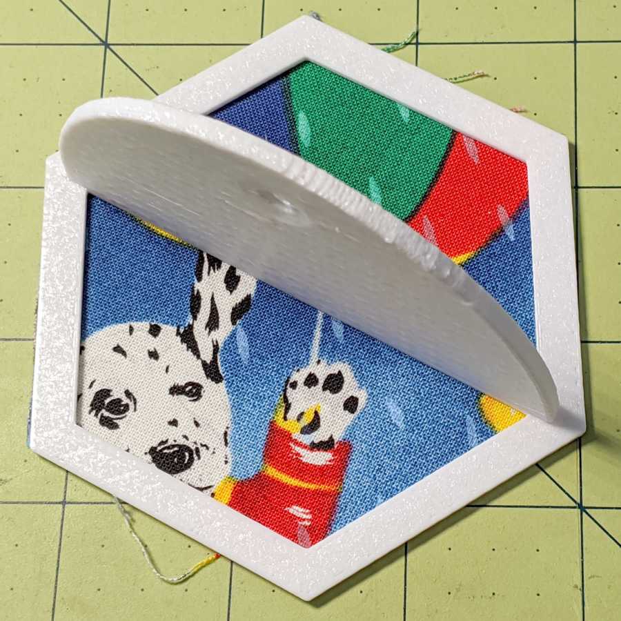
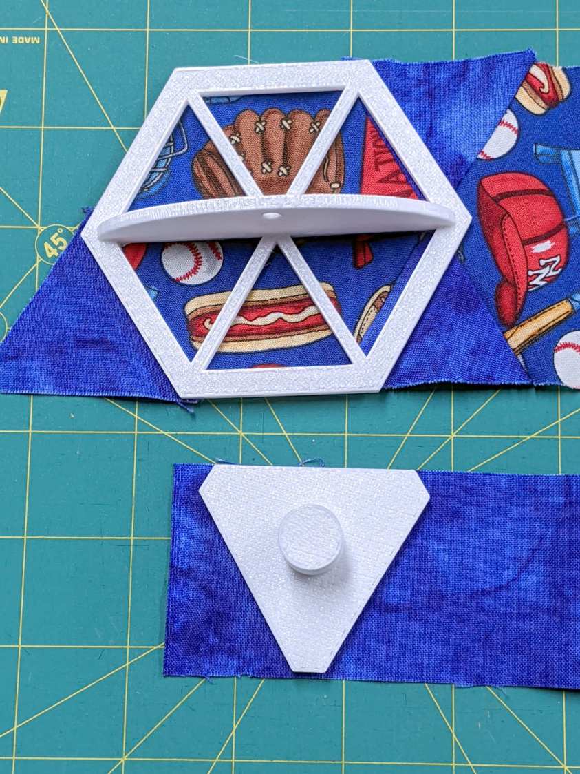
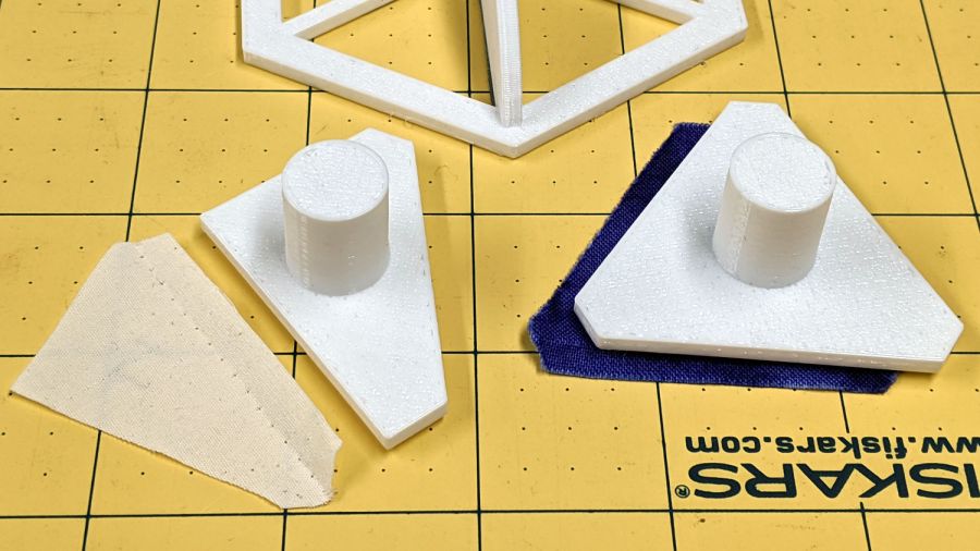
Mary took on the task of finishing a hexagonal quilt from pieced strips, only to discover she’ll need several more strips and the myriad triangles required to turn hexagons into strips. The as-built strips do not match any of the standard pattern sizes, which meant ordinary templates were unavailing. I offered to build a template matching the (average) as-built hexagons, plus a triangle template based on those dimensions.
Quilters measure hexes based on their finished side length, so a “1 inch hex” has sides measuring 1 inch, with the seam allowance extending ¼ inch beyond the sides. It’s difficult to measure finished sides with sufficient accuracy, so we averaged the side-to-side distance across several hexes.
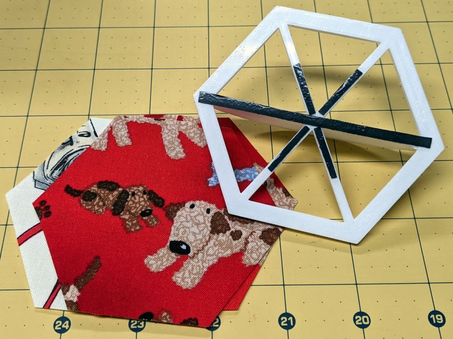
Some thrashing around produced a quick-and-dirty check piece that matched (most of) the stack of un-sewn hexes:
Quilting Hexagon Cutting Template
That one came from a knockoff of the circle template, after some cleanup & tweakage, but failed user testing for not withstanding the side force from the rotary cutter blade. The inside and outside dimensions were correct, however, so I could proceed with some confidence I understood the geometry.
Both the pattern width (the side-to-side distance across the inside of the hex) and the seam allowance appearing in the Customizer appear in inches, because that’s how things get measured outside the Basement Laboratory & Fabrication Facility:
You feed in one side-to-side measurement and all other hex dimensions get calculated from that number; quilters default to a ¼ inch seam allowance. Remember, standard quilt hexes are measured by their side length, so just buy some standard templates.
Both templates have non-skid strips to keep the fabric in place while cutting:
Hex Quilting Template – grip strips
I should have embossed the size on each template, but this feels like a one-off project and YAGNI. Of course, that’s how I felt about the circle templates, so maybe next time I’ll get it right.
As it turned out, Mary realized she needed a template for the two half-triangles at the end of each row:
Quilting Hex Template – half-triangle
It’s half of the finished size of the equilateral triangle on the right, with seam allowance added all around. The test scrap of fabric on the left shows the stitching along the hypotenuse of the half-triangle, where it joins to the end-of-row hexagon. Ideally, you need two half-triangle templates, but Mary says it’s easier to cut the fabric from the back side than to keep track of two templates.
This file contains hidden or bidirectional Unicode text that may be interpreted or compiled differently than what appears below. To review, open the file in an editor that reveals hidden Unicode characters.
Learn more about bidirectional Unicode characters
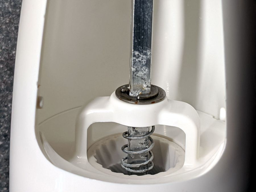
Being that type of guy, I’m reasonably sure I would not have bought what’s now clearly labeled as an OXO Radial Pepper Grinder for use as a salt mill:
OXO Salt Mill – corrosion
Mary recalls we got it at Target, back when one could go places and buy things, and I vaguely recall contemplating a wall of OXO gadgets. It’s been a while and I neglected to save the packaging for future reference.
Obviously not stainless steel, but not lethal, so we’ll continue abusing it.
In round numbers, a nasty COVID-19 infection ramps up for a week before you develop enough symptoms to finally get tested. Various states report various combinations of test results as confirmed / probable / tested “cases”, with “tested” including any possible combination (or lack thereof) of viral / antibody presence. As a result, the number of “daily cases” doesn’t mean much, but it’s the only number we’re likely to get. With that in mind, about 6% of those tested have a positive result for whatever they’re being tested for. Got that?
At some point within a week or two of being infected, tested, and found positive, about 2.8% of all cases will be hospitalized. That’s 2.4% of cases in the 18-49 age bracket and 4.3% of my decade (64-75):
Roughly a week (more or less, kinda-sorta) after hospitalization, 15% of all patients and 28% of those over 65 will die:
COVID-19 – Weekly Hospitalization Outcomes by Age – 2020-06-24
You get that chart from the Lab-Confirmed Hospitalizations page by dinking around with the controls for the lower-right pane. The Overall column represent 5800 patients and, as it happens, each column represents about 2000 patients.
Because it takes about three weeks to go from “infected” to “dead”, the ratio of [daily deaths today] to [daily positive test results from three weeks earlier] gives (In My Opinion) a better indication of the expected outcome than the simpler ratio of [today’s deaths] to [today’s test positives]. Because the news headlines always feature cumulative numbers, these numbers aren’t at the tip of anyone’s awareness.
The strong weekly component is surely a combination of data aggregation (no weekend reports?) and actual death events (nobody dies on Sunday?), but there’s no way to know from here. There’s plenty of noise in April which I decided to completely ignore; consult the raw data and draw your own conclusion.
Eyeballometrically, the lagged CFR has been declining linearly by 1% every 3 weeks since mid-May and should be around 2% in July. If you’re under 50 and in reasonable health, the news is even better, because you’re very unlikely to either need hospitalization or die from it. Again, work the numbers out for yourself from the raw data.
However, AFAICT, those results depend on a relatively unloaded healthcare system, because little of the US has (yet) to experience the catastrophic overload seen during the early onset in Washington state and NYC. This chart of ICU occupancy suggests the worst is yet to come for folks in states where expectations don’t match up to the reality of exponential growth:
COVID-19 – All-patient ICU occupancy – 2020-06-23
It seems having the ICUs tick along at 50% occupancy is about right, so the states with 70+% occupancy don’t have much surge margin.
Right now, COVID-19 is burning through the US population at about 30,000 confirmed new cases per day, which means 840 people will require hospitalization every day next week (in addition to all the usual hospitalizations for other causes) and, in another week, 126 people will die every day. Maybe 40 people under age 50 will die, so the human herd will develop immunity by killing off we Olde Fartes.
After I ran those numbers, the rate passed 40,000 cases per day, with no sign of slowing down and indications it’s getting worse faster. Scale my numbers up by 30%: 1100 hospitalizations and 170 deaths per day in a few weeks.
However, if you live in one of those dark purple states already showing 70+% ICU utilization, don’t do anything starting with “Hold my beer. Watch this!” because you will not get a welcoming Emergency Room reception. The CNN synoptic view of new cases continues to be informative.
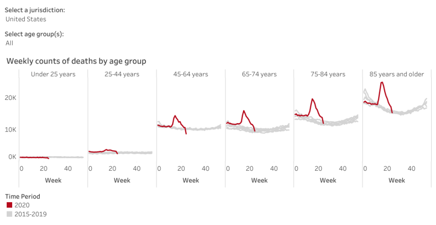
One of Mary’s cronies is married to a guy who knows this whole COVID-19 thing is a hoax: “They’d all have died of something else, anyway.” Plotting all-cause fatalities vs. age (2020 in red, last five years in gray) shows tens of thousands of people are dying from something new this year:
All-cause deaths by age – current vs historical – 2020-06-26
Before you do the happy dance about the downward slope toward the right, read the disclaimer:
Data are incomplete because of the lag in time between when the death occurred and when the death certificate is completed, submitted to NCHS and processed for reporting purposes. This delay can range from 1 week to 8 weeks or more, depending on the jurisdiction and cause of death.
Some of the decline is real, because NYC hospitals aren’t running out of body bags nowadays, but much of it seems due to the paperwork not catching up with reality.
Judging from the slope of the Johns Hopkins summary of daily cases in the US, corroborated by the CNN projections, the doubling time (before the most recent increases) runs around four weeks: five million cases by the end of July and ten million by the end of August. Later this year, we’ll know how well saying “It’ll be gone by AprilsummerElection Day 2021″ without doing anything has worked out for us.
The overall death rate should decline in a few years, because those (of us?) who died early will reduce the later rate, but it’s not something to look forward to.