Ed Nisley's Blog: Shop notes, electronics, firmware, machinery, 3D printing, laser cuttery, and curiosities. Contents: 100% human thinking, 0% AI slop.
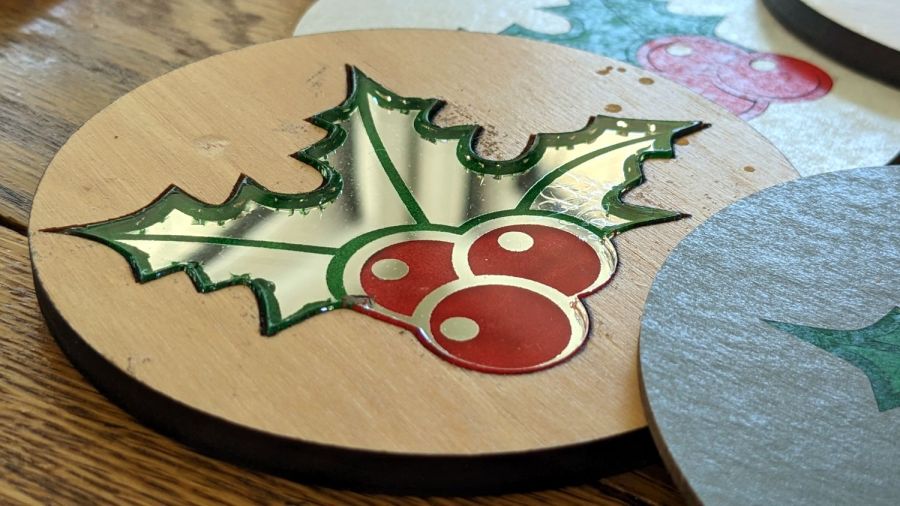
The improved Holly Mirror Coaster looks pretty good:
Holly Coaster – overview
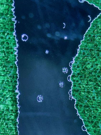
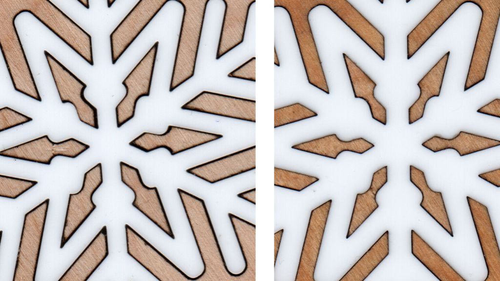
Until you realize some of those specks aren’t surface dust and take a closer look:
Holly Coaster – mirror speckles 1
The surface scratches are doubled by their reflection in the bottom mirror. The little dots that aren’t doubled reveal marks in the mirror surface itself.
In this case, they cause defects in the mirror coating allowing alcohol from the fat-tip permanent markers coloring the engraved areas to hit the acrylic. The starbursts come from stress cracks around the punctures.
Peering even closer shows similar cracks along the edges of the colored areas:
Holly Coaster – mirror speckles tight detail
Not much to do about the random speckles, but it’s obvious I must up my coloring game.
Which would be significantly easier if rattlecan spray paint sprayed at winter temperatures …
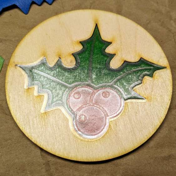
Other than demonstrating that it’s possible to laser-engrave a 3 mm deep pocket in a ¼ inch thick piece of scrap paneling, the process didn’t have much to recommend it:
Holly Coaster – mirror flaws
So I re-did the layout to put the 3 mm mirror in 3 mm thick plywood:
Holly Coaster – overview
The coaster has a self-adhesive cork pad on the bottom, which required an intermediate adhesive layer holding the aluminized Mylar reflector on the bottom of the mirror to brighten the colored areas.
The LightBurn layout shows all the pieces:
Holly Mirror Coaster – LB layout
The plywood cuts with the good side down, although “good” is certainly a judgement call with B/BB grade plywood. I cover the good side with blue painter’s tape to reduce scorch marks. In a real application, you’d do some sanding and finishing, probably before cutting; in this case, I want to see what happens to bare wood in coaster duty.
Engrave and cut the mirror with the backing upward:
I colored the engraved areas with fat-tip permanent markers, despite knowing the alcohol will crack the acrylic. In real life, you’d use spray paint, probably with laser-cut tape masks.
The adhesive layer extends 2 mm beyond the mirror perimeter to stick onto the bottom face of the plywood:
Holly Coaster – adhesive placement
Peeling off the paper reveals the adhesive tape stuck to the back side of the mirror:
Holly Coaster – adhesive exposed
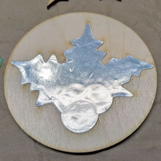
Apply the similarly embiggened aluminized Mylar to the adhesive:
Holly Coaster – mylar placed
Cutting the holly shape directly from the original foot-square adhesive sheet lets me tuck smaller shapes into the remaining uncut areas. In a production environment, however, joining the Mylar and adhesive (perhaps using pre-cut squares), then cutting them as one sheet would definitely simplify the process.
Then peel-n-stick a cork disk (thus explaining why the plywood is exactly 4 inch OD) on the bottom:
Holly Coaster – edge view
I’ve been aligning the cork by feel, which explains the half-millimeter overhang along the right side. Inexplicably, I have yet to justify an alignment fixture.
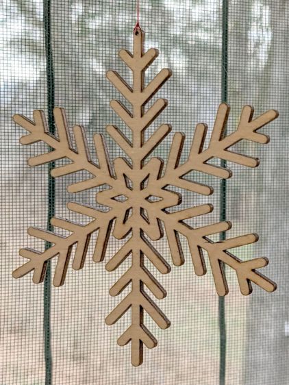
After the first two snowflake coasters, it finally penetrated my thick skill that putting a 1 mm hole in the flake cut from the center of the plywood would convert it into a decorative window hanging:
Snowflake Hanger – plywood
Admittedly, I may be using the word “decorative” in a manner you had not previously encountered, but work with me on this.
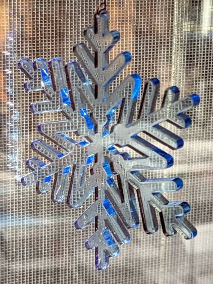
Cutting a similar flake from transparent acrylic looks better:
Snowflake Hanger – blue acrylic
Transparent acrylic turned out to be, well, too transparent, so I set up a LightBurn layout to “engrave” a light frosting on the flake before cutting it out:
Snowflake Hangers – engraving in situ
That worked for all subsequent flakes, but I had to do something about the first few flakes. After realizing that the time to engrave an object depends only on its width, I set up a rectangle with the proper parameters, snugged two forlorn flakes next to each other, and fired the laser:
Snowflake Hangers – retroactive engraving
I thought using cardboard was a Good Idea™ for a stable backing, but lightly vaporizing the top layer produced an unbelievable amount of filth:
Snowflake Hangers – frosted
I had to scrub those poor flakes with dish detergent and a toothbrush to get them even close to their former pristine state; the blue one may never recover.
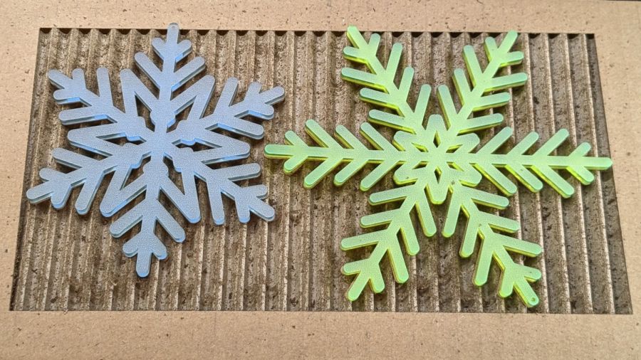
Anyhow, frosted flakes look good if you don’t look closely:
Snowflake Hangers – frosted
The grid pattern comes from the window screen in direct sunlight; the vertical bars are DIY BirdSavers.
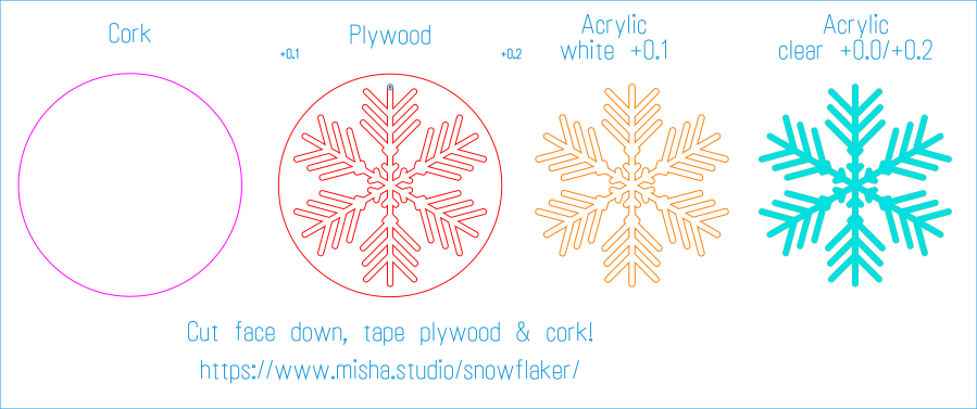
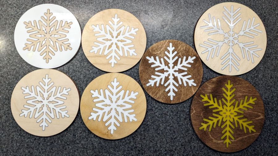
The LightBurn layout produces 120 mm coasters to fit my 20 ounce mugs:
Snowflake Coaster 120 mm – LB Layout
You get two hanging flakes: one plain plywood and one frosted acrylic!
The two on the left are the original snowflakes with interchanged innards and, perforce, no kerf compensation.
The upper-left coaster has a wood flake surrounded by acrylic, which makes a sharp clack when you set a glass down on it. The wood surrounds emit a much more pleasing clunk.
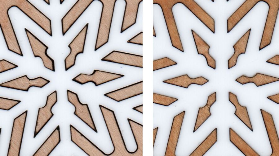
The next two have 0.1 mm compensation applied to their acrylic snowflakes, which produces snug fit (original on the left, compensated on the right):
Snowflake Coasters – kerf corr 0.0 vs 0.1 mm
Applying 0.2 mm compensation makes the flakes impossible to push in, so the true compensation is somewhere just over 0.1 mm. I think you could optimize for a specific wood and acrylic combination, but, as with 3D printing, any change requires something different.
The little arrowhead shapes tend to get lost, so collecting them on a strip of tape while you’re hunting in the chip tray helps:
Snowflake Coasters – plywood cutouts
The dark flake on the right got a coat of walnut stain, as did the two darker coasters in the first picture. It looks better in person than in the photo, although Mary still thinks the lighter wood sets off the white acrylic just fine.
The two large (120 mm OD) coasters fit my 20 ounce mugs, with the Nanook Memorial Coaster in the lower right.
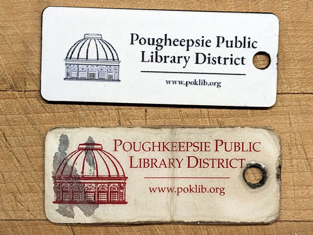
The rather battered library card on the bottom has been rattling around on Mary’s keyring since late in the last millennium:
Library card tags – front
I made the one on the top as a replacement, because Mary wanted one, but the library no longer issues keyring cards these days.
The front surface was laid out in The GIMP, inkjet-printed on good paper, cold laminated, laser-cut with LightBurn’s Print-and-Cut process, then affixed to the acrylic tag with really good double-sided tape:
Adriance Card – LightBurn PnC layout
I cut and applied the tape after cutting the tag, but the next time around I’ll apply the tape to the stock and cut both together to improve the edge alignment.
The smaller text uses dot mode and the bars & number are engraved:
Library card tag – detail
In retrospect, it’s painfully obvious the engraving passes should run parallel to the bars, rather than perpendicular to them.
The barcode uses Codabar encoding generated with a Codabar font. I scaled the graphic block slightly larger than the original in the hope of making it more readable.
I determined the start and stop characters by trial and error; for this card, they’re A and B. Which could, perhaps, stand for Arlington Branch, but might equally well be coincidence.
It worked perfectly on the first scan at the library counter and apparently went entirely unnoticed. I trust duplicating a library card does not constitute a federal offense.
For what should be obvious reasons, however, I’m not posting the LightBurn layout.
Despite cogent reasons for not buying another Sears vacuum cleaner, the brand currently represents a local maximum of the desirability curve: cheap, readily available, works well enough, and, surprisingly, bags for the defunct Progressive (whatever that meant) vacuum seem to fit just fine.
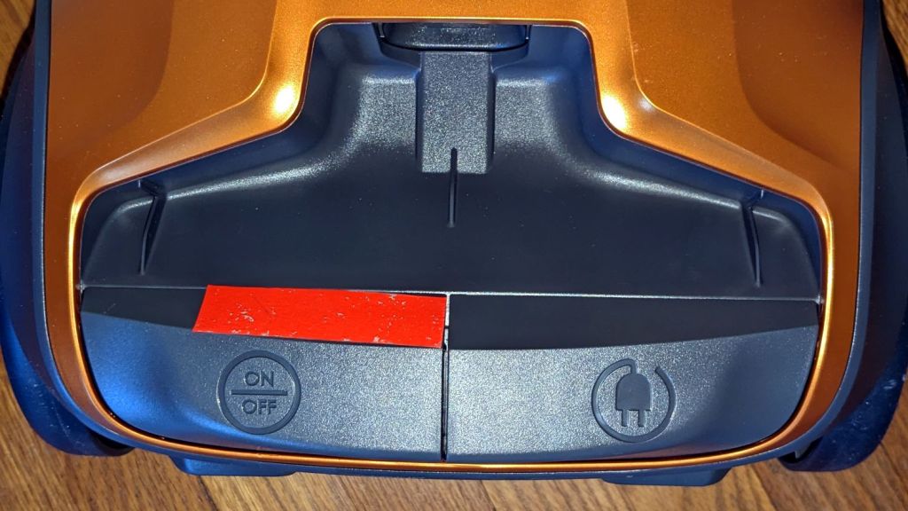
But the new one does come with some annoyances, starting with trendy dark gray engraved / molded control markings:
Sears Vacuum – power and cord controls
Quick: from the other end of the vacuum hose, which one must you stomp to turn it off?
It also has a simple rotating suction control ring at the handle:
Sears Vacuum – marked suction vent control
Which, as you can tell from the fluorescent tape, featured the same embossed and unreadably small dark gray markings.
Because that ring and its glaring tape is invisible from the user’s end of the handle, I eventually duct-taped the ring in position to prevent another inadvertent loss-of-suction accident.
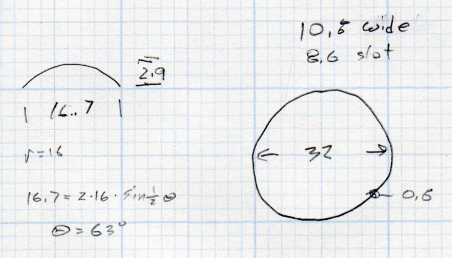
If we ever need reduced suction on a regular basis, I’ll conjure a better ring from the vasty digital deep:
Sears Vacuum – suction vent doodle
I obviously no longer form deep emotional attachments to these things …


