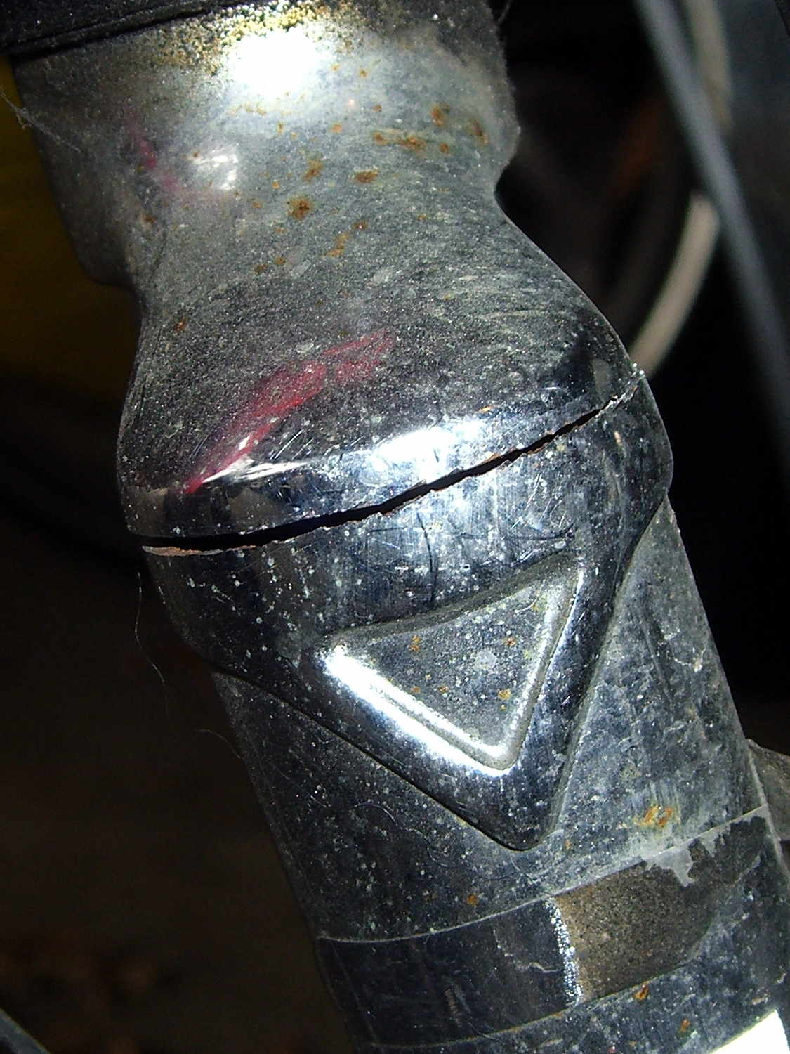
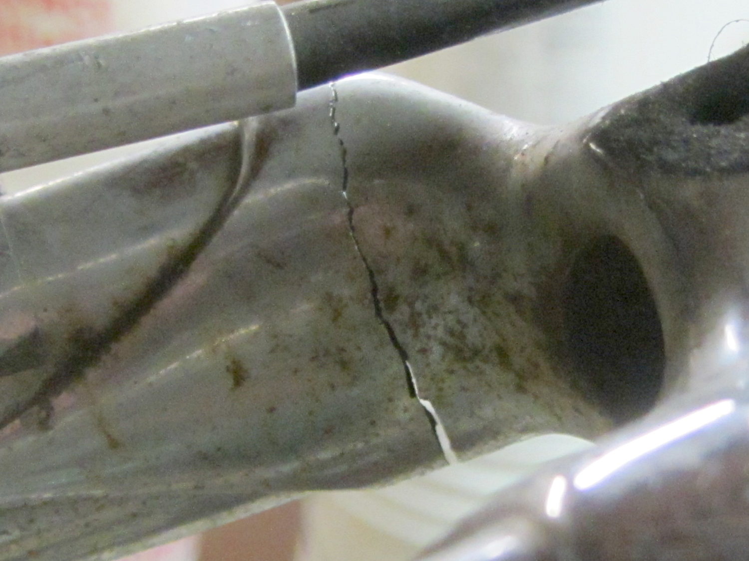
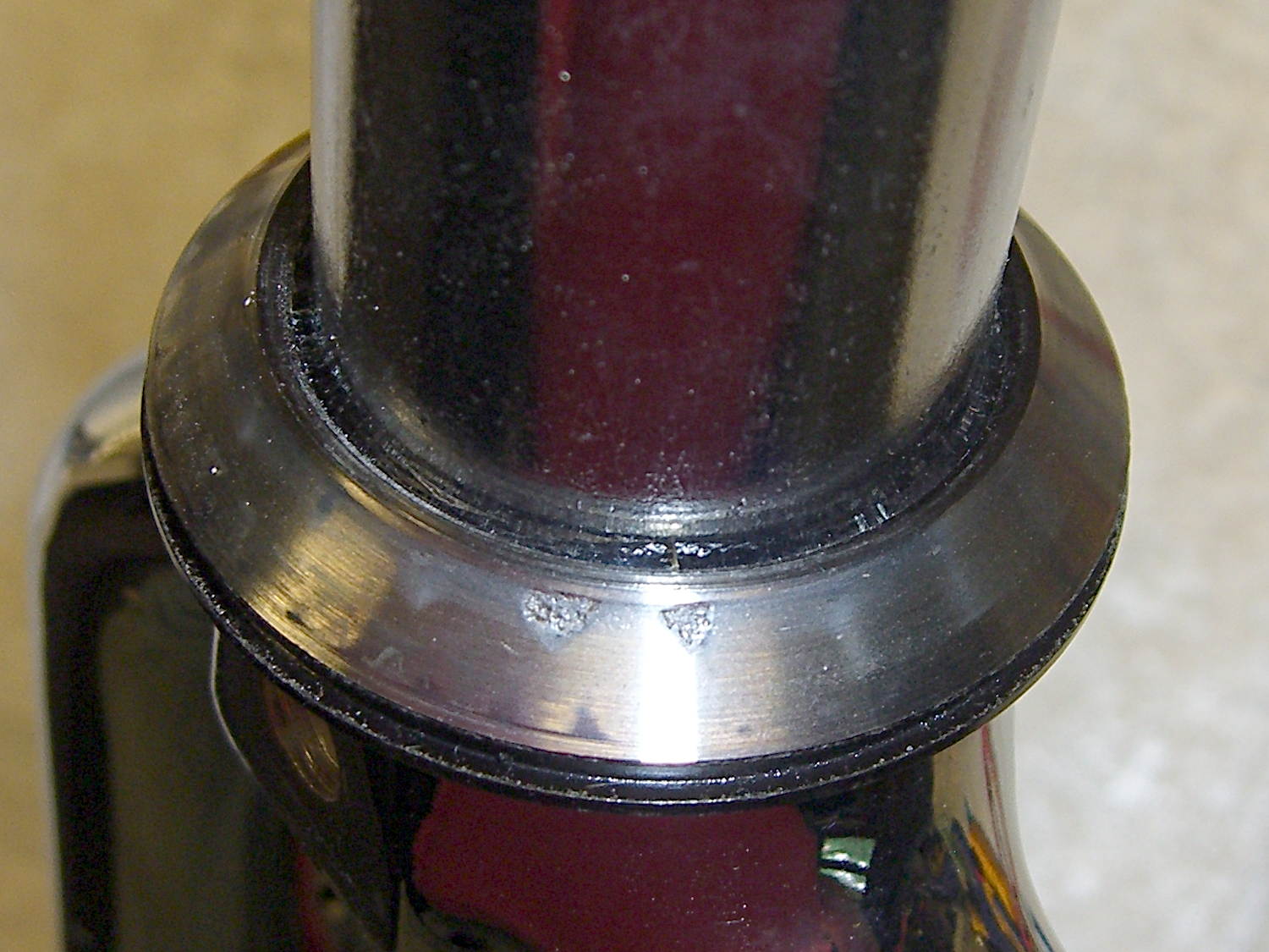
A view from the wheel side shows the crack in my Tour Easy’s fork lug had opened a bit more to the rear, which is about what you’d expect from the forces involved:
Removing the handlebar stem from the fork steerer tube requires removing the fairing, its mounting brackets, the fender, a speed sensor, then snipping cable ties to release all the cables and wires. Minus the prep work, removing the fork from the bike isn’t anything special.
The lower bearing (a YST 8311N in black) has rollers, not balls. The headset has J.I.S. 1 inch dimensions, captured in a screen grab to forestall link rot:
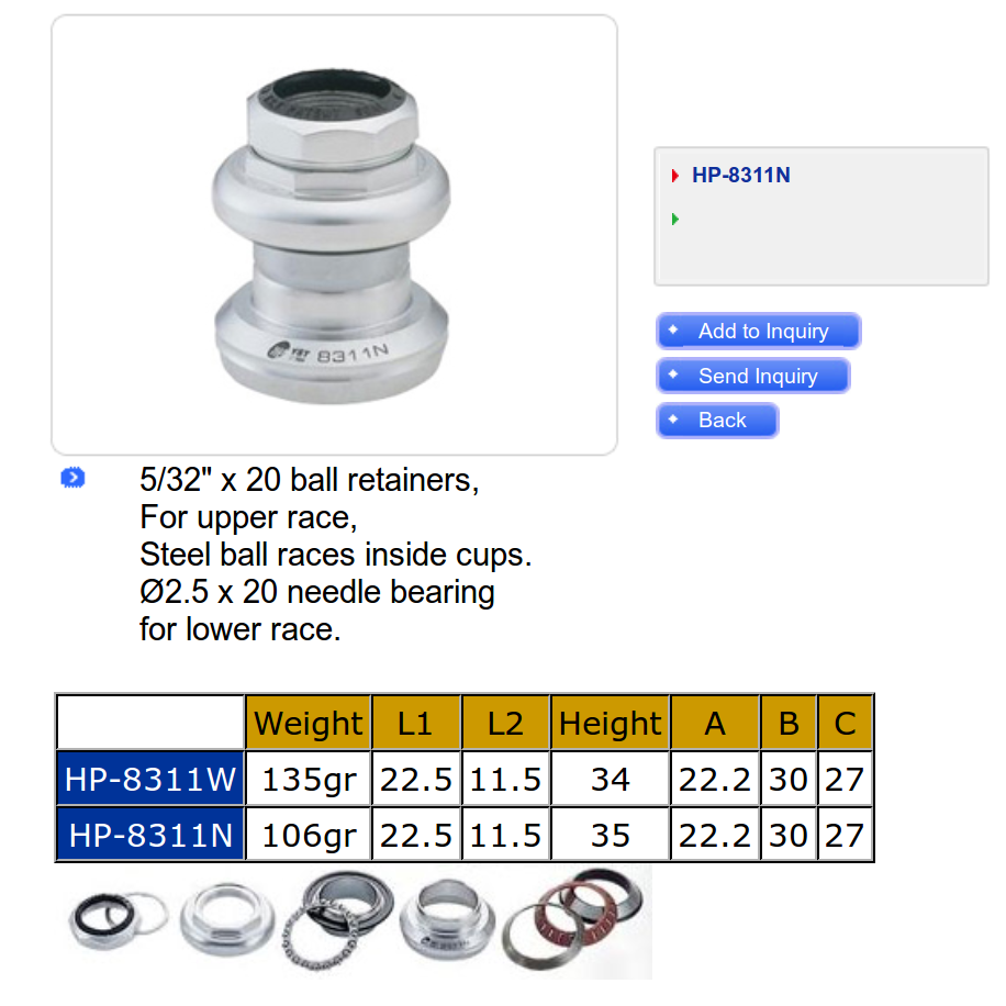
Which means cheap & readily available ISO standard headsets aren’t a drop-in replacement. The incomparable Harris Cyclery has J.I.S. ball-bearing headsets in stock and their Tange Levin CDS HD1002 needs just 1.6 mm of additional washer to match the YST’s 35 mm stack height…
The front side of the crown got rather graunched over the last 14 years, but I punted the problem by rotating the race half a turn to put the eroded spots toward the rear, where they’ll be under minimal stress:
Re-seating the race brought an ancient Headsetter tool from the drawer:

It’s basically galvanized pipe, chamfered on one end, with a set of nuts & washers on a length of all-thread rod just slightly too short for the occasion: this might be the second time I’ve used the thing and I had to supply my own all-thread & nuts. Ah, well, it probably predates the Tour Easy’s design by a decade.
The lower headset race looked to be in pretty good shape, so I left it alone. Normally, such bearing damage gives you indexed steering, but Tour Easy handlebars provide so much lever arm that nothing interferes with the bike’s steering.
The new fork didn’t have a notch for the keyed washer isolating the locknut from the upper bearing race. The usual advice is to file off the key and apply threadlocker, which makes adjusting the two nuts tedious, so I restored the notch in the steerer threads:
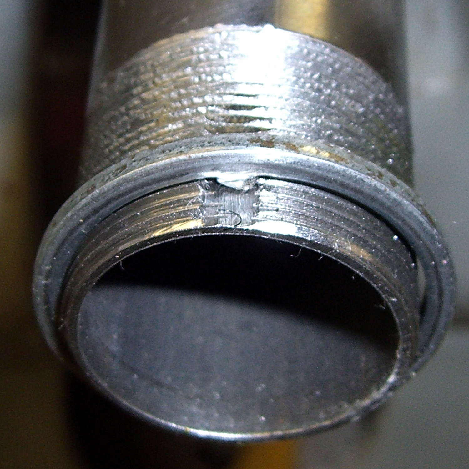
Yes, that’s a lethally sharp steel shaving from the not-very-well-reamed ID curling up in the middle of the notch.
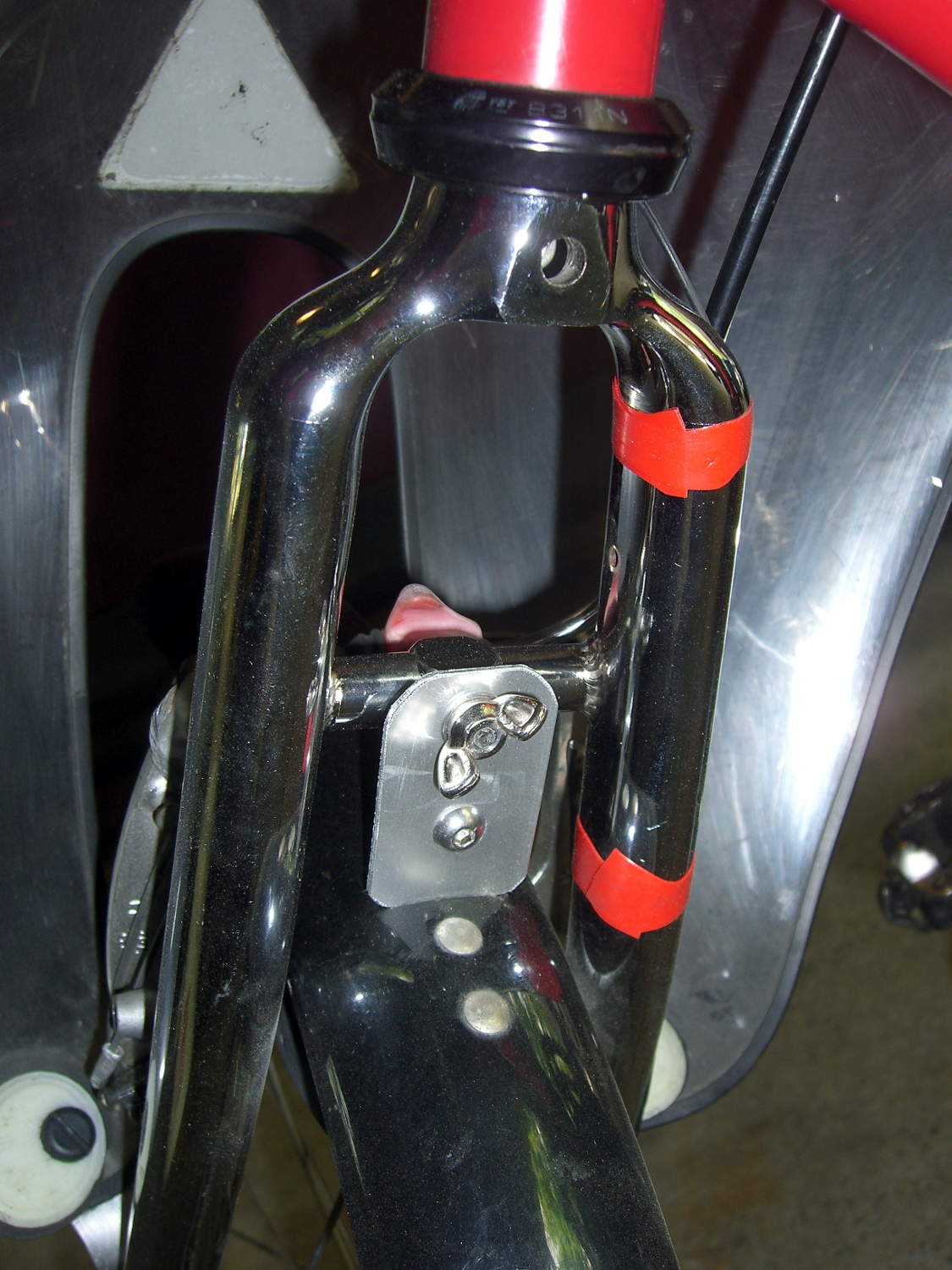
The fender mount bridge on the new fork sits half an inch higher in relation to the brake bosses, putting the fender against the V-brake cable hardware. Anything touching the V-brake messes up the pad-to-rim alignment, so I conjured a snippet of aluminum to lower the fender just enough to clear the brakes:
I think that calls for a nice 3D printed bracket, too, but the snippet got me back on the bike faster. When I preemptively replace the fork on Mary’s bike, then I’ll do a proper bracket for both of us.
The garish red silicone tape replaces the previous black cable ties. It matches the tube paint surprisingly well and doesn’t look good on the fork, so I’ll replace it with cable ties in due course.
A few miles of shakedown riding settled the crown race against the fork, another 1/6 turn of the upper race / lock nut snugged up the bearings, and it’s all good again.
Wow, it’s great to be back on the bike!
(Due to the vagaries of writing this stuff up ahead of time, there’s actually two weeks of realtime between the post that appeared on Monday and this one.)