Ed Nisley's Blog: Shop notes, electronics, firmware, machinery, 3D printing, laser cuttery, and curiosities. Contents: 100% human thinking, 0% AI slop.
Sony no longer offers the NP-FS11 Li-Ion batteries required for my DSC-F505V camera, so I’ve been using “generic” replacements for quite some time. My experience has been mixed: some batteries provide a reasonable amount of run time, others provide almost none.
Feeding the appropriate keywords into Froogle gives you a range of battery suppliers, with offerings from, as of this writing, $3 to $103. Perhaps not surprisingly, the image for a $70 battery exactly matches the one on my desk that cost perhaps $15 a few years ago… although I’m certain that the actual battery you’d get wouldn’t match that picture.
I just bought three NP-FS11 batteries from the usual low-buck Hong Kong eBay supplier: six bucks apiece, shipped halfway around the world. The eBay listing claimed 1800 mAh, which seemed aggressive, and the batteries sport a 3900 mAh label, which is flat-out impossible.
Frankly, I didn’t expect much and here’s the discharge test graph to show I wasn’t disappointed. I used a 1-amp rate as a reasonable guess at the camera’s peak draw, although that might be a touch high for a continuous discharge.
Generic Sony NP-FS11 Li-Ion Batteries
The top blue curve is from a two-year-old literally no-name battery (no logo, no nothing!) that still provides decent run time; it’s the one matching that $70 battery. It provides about 1100 mAh, reasonably close to its 1300 mAh rating.
The middle curves, black and purple, are two of the new cells that provide about 900 mAh: half the as-listed-on-eBay capacity, 25% of the absurd label value. Their very low terminal voltage during most of the discharge says that these won’t provide much run time at all.
The green curve piddling off on the bottom is the third new cell, which is obviously defective. As I said, I didn’t expect much and I certainly wasn’t surprised.
The red curve is an old and completely defunct batteries.com offering that never provided good service.
Here’s another plot of three successive charge-discharge cycles for just the three new batteries. The first curves (at 1.0 A) correspond to what you see above, the remaining two sets (at 0.5 A) are the next two cycles. Batteries G and I have improved, H remains a dud.
MaxPower NP-FS11 Battery Tests
Given the varied offerings on the Web, I believe that there is no way to ensure you’re getting a known-good battery from a reputable supplier. It’s absolutely certain that price does not correlate with quality; the ones I bought simply establish that low-end offerings are crap.
The purchase was worth it for the amusement value alone; I don’t expect any action from the vendor, although I did send a copy of that graph with some explanatory text. The question is whether I should give them a five-star rating for prompt delivery…
As it happens, there’s enough room to slide a standard CR123A-size cell into the battery compartment. I think a bit of Quality Shop Time applied to a dead NP-FS11 battery case (and the vital Sony “Infolithium” DRM module) will provide a baseplate with all the proper connectors. Perhaps I can conjure up a “battery” containing a single cell of known-good quality?
Primary CR123A cells supply only 3 V, not the 3.6 V the camera really wants, so I can’t use disposable cells.
In the process of pulling together a talk for the Trinity Robotics contest, I rediscovered my spreadsheet of spectral response data. It’s been compiled over the years from myriad sources (utterly without attribution), suffers from gaps & interpolations, and undoubtedly emits a fairly high bogon flux density.
To wit: trust nothing!
Spectral Response
Horizontal scale has UV on the left and IR on the right.
Vertical scale is linear, roughly corresponding to power in or out at a particular wavelength. It should, of course, be logarithmic, but that’s in the nature of fine tuning, as no source data has that much resolution.
Things to note:
Human eyes are tuned to see chlorophyll and not much else. That must’a been important at one time or another…
The nice bumps on the left are visible LEDS: violet blue green orange yellow red. The IR LED over on the right stands alone.
There’s no overlap between human vision and IR LED emission, but you can still see a dim red glow if you stick it right up against your eye.
Don’t do that with a UV LED, though.
White LEDs are just blue LEDs with fancy phosphors. That’s why the spectrum looks like a blue LED with a bump in the yellow-orange neighborhood. They’re not well-balanced at all.
High-pressure sodium lights kill IR sensors stone cold dead. Look at that peak, perfectly aligned with the photodiode response. If you could see in IR, you’d go blind. That’s what made the Trinity contest so challenging for so many years; they recently switched to fluorescent lighting and the complaints dropped dramatically.
Those emission spikes are why camera color correction doesn’t work well: if there’s no energy in a region, you can’t crank the gain up enough to make a difference.
An 87C Wratten filter is great for excluding visible light, but the overlap with that HP-Na spike tells you it won’t do jack with that sort of lighting.
Fluorescent tubes produce intense spikes at 436 and 546, corresponding to mercury emission lines. Their phosphor emissions extend far into the IR, too, but the data I have doesn’t include that region.
Ditto for metal halide bulbs.
To produce the graph, apply this bash script to the CSV file…
#!/bin/sh
export GDFONTPATH="/usr/share/fonts/TTF/"
gnuplot << EOF
#set term x11
set term png font "arialbd.ttf" 24 size 1200,800
set output "Spectral Response.png"
set title "Spectral Response"
#set key 28,-0.75 Left reverse samplen 2 noautotitles
#set key right noautotitles
unset key
unset mouse
set bmargin 4
set grid xtics ytics
set xlabel "Wavelength - nm"
set format x "%3.0f"
#set xrange [0:9]
#set xtics 0,10
#set mxtics 4
set ytics nomirror autofreq
set ylabel "Relative Response"
#set format y "%3.0f"
set yrange [0:1.1]
#set y2label "Panel Power - mW"
#set format y2 "%3.0f"
#set y2range [0:800]
#set y2tics 200
set datafile separator ","
set label 1 "Eye" at 550,1.05 font "arialbd,14" center
set label 2 "White" at 480,1.05 font "arialbd,14" center
set label 3 "IR" at 940,1.05 font "arialbd,14" center
set label 4 "87C Filter" at 1050,0.85 font "arialbd,14" center
set label 5 "Photodiode" at 825,1.05 font "arialbd,14" center
set label 6 "Tungsten" at 1050,1.00 font "arialbd,14" center
set label 7 "Fluor" at 410,0.42 font "arialbd,14" right
set label 8 "Halide" at 680,0.41 font "arialbd,14" left
set label 9 "HP-Na" at 805,0.60 font "arialbd,14" right
set label 10 "Violet" at 410,1.05 font "arialbd,14" center
set label 11 "Red" at 635,1.05 font "arialbd,14" center
plot    "Spectral Response Curves.csv" \
 using 1:2 with lines lt -1  lw 3 title "Eye", \
 "Spectral Response Curves.csv" \
 using 1:3 with lines lt 1 lw 2 lc rgb "light-blue" title "White" , \
 "Spectral Response Curves.csv" \
 using 1:4 with lines lt 1 lw 2 lc rgb "dark-violet" title "Violet" , \
 "Spectral Response Curves.csv" \
 using 1:5 with lines lt 1 lw 2 lc rgb "blue" title "Blue" , \
 "Spectral Response Curves.csv" \
 using 1:6 with lines lt 1 lw 2 lc rgb "green" title "Green" , \
 "Spectral Response Curves.csv" \
 using 1:7 with lines lt 1 lw 2 lc rgb "gold" title "Yellow" , \
 "Spectral Response Curves.csv" \
 using 1:8 with lines lt 1 lw 2 lc rgb "orange" title "Orange" , \
 "Spectral Response Curves.csv" \
 using 1:9 with lines lt 1 lw 2 lc rgb "red" title "Red", \
 "Spectral Response Curves.csv" \
 using 1:10 with lines lt 1 lw 2 lc rgb "magenta" title "IR" , \
 "Spectral Response Curves.csv" \
 using 1:11 with lines lt 1 lw 2 lc rgb "dark-red" title "Photodiode" , \
 "Spectral Response Curves.csv" \
 using 1:12 with lines lt 1 lw 2 lc rgb "dark-gray" title "87C Filter" , \
 "Spectral Response Curves.csv" \
 using 1:13 with lines lt 1 lw 2 lc rgb "dark-yellow" title "Tungsten" , \
 "Spectral Response Curves.csv" \
 using 1:14 with lines lt 1 lw 2 lc rgb "orange-red" title "HP-Na" , \
 "Spectral Response Curves.csv" \
 using 1:15 with lines lt 1 lw 2 lc rgb "brown" title "Halide" , \
 "Spectral Response Curves.csv" \
 using 1:18 with lines lt 1 lw 2 lc rgb "midnight-blue" title "Fluorescent"
EOF
And the data in CSV format because WordPress doesn’t allow spreadsheets…
I accidentally-on-purpose spilled some sunflower seeds when I refilled the bird feeder, just to see who was awake. Surprisingly, the seeds remained untouched for about two days, then this fellow appeared… and cleaned them up in a matter of minutes.
Spring is on its way, despite the recent storms!
Chipmunk with sunflower seeds
Taken with the Sony DSC-H5 zoomed in all the way (12x) through the 1.7x tele-adapter. It’s not a great combination, but it’s better than no picture at all. This is a crop of about the middle half of the image, with a touch of unsharp mask, then scaled down 2:1 for improved webbishness. After all that, it’s a wonder you don’t mistake the critter for a moose…
I passed a few minutes in the high school lobby (while waiting for the Fencing team to return from a competition) trying to decipher the Braille signs. I’ve always had my doubts about the utility of these things, but I suppose if you’re going to have signs, they may as well have tactile lettering, too.
Anyhow, what little I knew about Braille (six dots, um, 64 symbols, um, tapers off after that) didn’t extend to actually knowing any of the letters, but how hard could a substitution cipher be? I figured out most of the letters in Stairway quickly, but some were obviously missing. Perhaps Braille includes symbols for common digraphs?
Stairway
The Library across the lobby provided more letters, with obvious mismatches that showed I wasn’t anywhere near as clever as I thought (a distressingly common situation these days). Perhaps the two leading dots indicate “Here be there text”?
Library
Then I found the Ticket Booth, which strongly suggested digraph symbols.
The two leading dots are a sticky uppercase shift marker
Fortunately, I didn’t encounter real contractions
There’s an 8-dot variant coming into play
Some years ago we took an introductory course in American Sign Language when one of my not-quite-a-nephew (son of a cousin, whatever that is) went deaf. Without anyone for day-to-day practice we never achieved fluency, but that was a window into another world, too. We still pass a few basic signs to each other across a noisy room …
Photography note: photograph signs from far enough off-axis that the flash hotspot on the surface is out of the image. If you must get a rectangular sign out of it, apply a perspective transformation to the image.
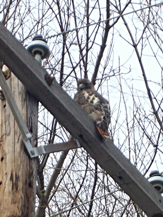
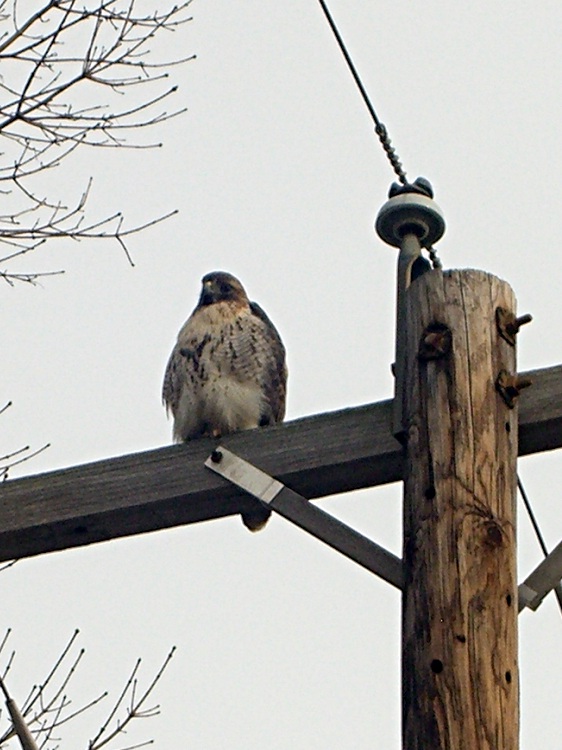
It was quite cold (notice his fluffy down coat) and he was content to watch us go by. In fact, it was so cold the crows were just flying by without doing their usual hawk harassment.
Taken with a Casio ZX-850 pocket camera: no fancy optics. Looks it, too… these are tight crops from much larger images. Click for bigger, but not wonderfully detailed, images.
Mary found a sliver chipped from the outside edge of a Corelle dinner plate, which provides an opportunity to see something that’s normally invisible: the ceramic layer inside its glass coating.
Overall, the sliver is nearly two inches long and about the same width as the plate is thick.
Corelle sliver
Peering through the microscope at the left end, the glass layer is most obvious along the top edge. You can barely see it along the bottom, where the chip thins to a razor edge.
Corelle sliver – detail
On the right end the upper and lower glass layers are a bit more obvious, at least with the light arriving nearly horizontally and after some aggressive exposure hackage,
Corelle sliver – side light
The ceramic has a slightly higher coefficient of thermal expansion than the glass, so it puts the glass under a tremendous amount of compressive stress as the newly manufactured plate cools. Glass is really strong in compression (and terribly weak in tension), so the plate becomes remarkably hard to break. More details there and there.
The plate rims do tend to chip, however, if you own them as long as we have. These are the long-discontinued Old Town Blue pattern: over three decades old by now.
Oddly, they’re still under warranty: back in the day, Corning sold its then-new Corelle with a Lifetime Warranty. Nowadays, you get three years for the mid-grade line, five years for thicker plates, and a mere one year for stoneware (whatever that is). I suppose enough people actually took them up on the warranty to make it economically impractical.
I ran a fine diamond file over the chipped edge and it’s OK. Eventually, we’ll break down and get new plates, but there’s no sense rushing a decision like that…