-
SCP Warning Label Earrings: Rattlecan Feasibility Test
Our Young Engineer provided different specs for earrings than I’d been using, which prompted a quick-n-dirty test to see how they might come out:
SCP Warning Labels – test 1 The images come from the SCP Wiki with tweakage for better contrast:
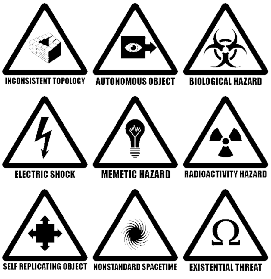
SCP warning signs – BW 3×3 Then I traced them into LightBurn vectors suitable for engraving, added hanging holes, and fit a perimeter cutout. This being a test, I took a number of shortcuts resulting in slightly off-center engravings and ignored a number of image botches (most notably in the
Inconsistent Topologyfigure.A quick painting fixture kept (most of) the rattlecan paint off the edges:
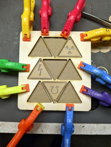
SCP Warning Labels – fixture clamping The acrylic is old enough to have brown paper protective layers, rather than fancy plastic sheets. I peeled various combinations and shot various sides with purple:
SCP Warning Labels – purple coat Remove some, flip others over, and hit ’em with yellow:

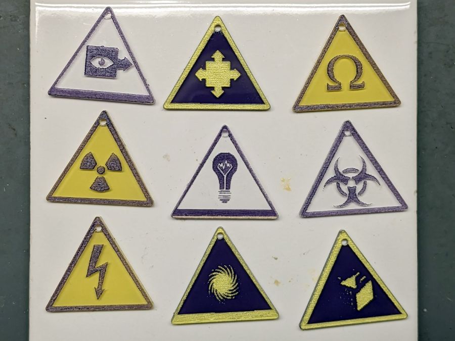
SCP Warning Labels – yellow coat I expected purple markings over a yellow background to look best:

SCP Warning Labels – purple over yellow But the inverse version seems more contrasty (ignore the off-center cutout):

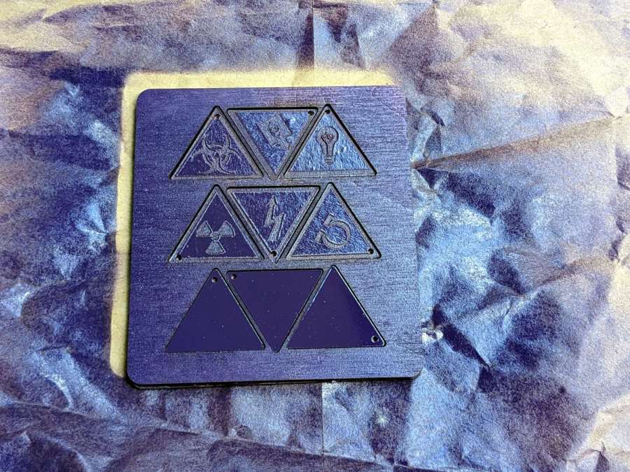
SCP Warning Labels – yellow over purple I think the purple-on-clear version would look better with edge-lit acrylic:
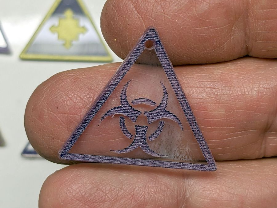
SCP Warning Labels – purple over clear The 0.15 mm line spacing seems too coarse, but trying to get a perfectly flat engraved bottom seems futile.
A second coat of paint on the engraving would definitely boost the contrast.
If you were going to do this for real, you’d definitely recreate the images with vectors right from the start, using the original images as inspiration.
All in all, I like ’em, but there’s some improvement required before anybody else does!
-
Subscribe
Subscribed
Already have a WordPress.com account? Log in now.
