-
Real Estate Sale Signage
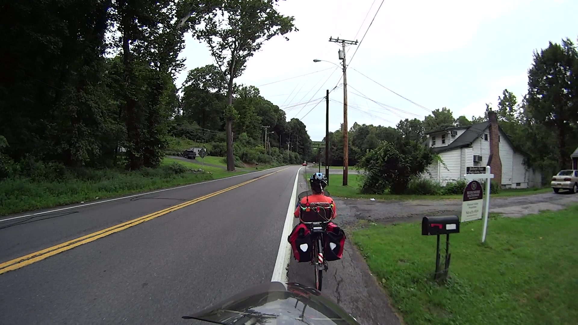
Real Estate Agencies used to post property marker signs like this:
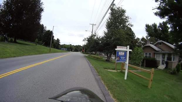
FSReEx-168 Even far off to the side, a bright background color catches your eye:

FSWeRe-107 The signs sported primary colors, reasonably large type, and simple words, making them almost readable in those pictures and definitely legible from the driver’s seat. While not particularly handsome or stylin’, they got the message across: this house is for sale.
Then a strange thing happened.
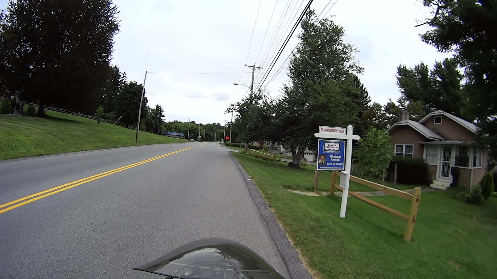
Berkshire Hathaway somehow got into the real estate business and Borged several of the local agencies. BH being a Name Brand with a connotation of wealth & taste, their branding imposed a subtle touch on the new signage:

FSBkHath-113 No, you can’t quite read that in real life, either, although the agent’s name and number on the header come close to the old standard.
One day, a old-school sign appeared along one of our usual routes:

FSHoLa-127 Although white and green don’t pop out of the background, the sign has enough contrast that you can read what’s needed.
Then they became affiliated with Christie’s, the Big Name in the realm of high-end auctions. I have no idea what Christie’s has to do with real estate, but if Berkshire Hathaway can do it, it seems Christie’s thinks they can do it even better.
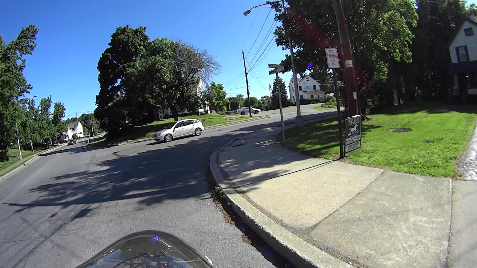
In any event, the Christie’s Corporate Standard evidently calls for very, very subtle signage:

That sign might mark a high-end bed and breakfast, but certainly does not tell me that the place is for sale: none of the text approaches readability from the street, certainly not at normal travel speeds, and nothing about it even suggests that I should take action.
A few weeks later, two hang tags added a COMMERCIAL note (the property evidently has potential to become an office or retail space) and the agent’s name and phone number in minuscule type:

FSBase-128 After a while, a very bright red do-it-yourself HOUSE FOR SALE placard suggested the property owner wasn’t entirely satisfied with the results to date:

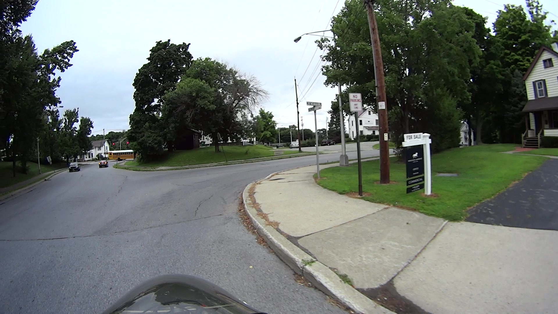
FSSign-148 The high-contrast black-on-white FOR SALE header definitely doesn’t match the rest of the sign, but its more legible information might motivate you to pause and puzzle out the rest. The red placard vanished a few days after the header appeared, leaving us with this peculiar mix:
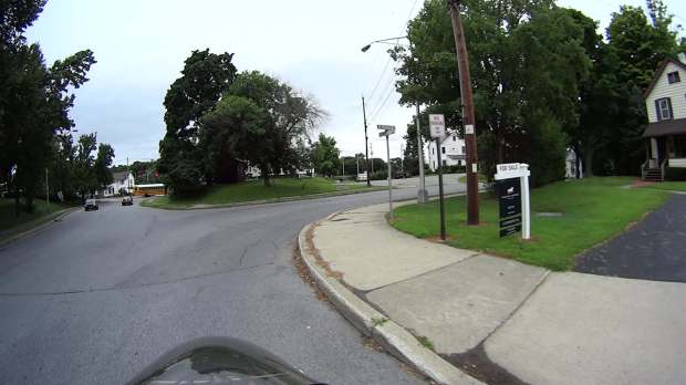
FSHeader-153 None of the (numerous) Christie’s signs in the area have a header, so this may be a case of a squeaky wheel getting greased. I won’t be surprised to see a corporate image change, including larger type, as these fancy signs weather away.
Perhaps the correct conclusion to be drawn is that, in this Internet age, nobody buys a house based on the quaint custom of driving by a house-with-sign, thinking “Hey, that’s perfect for me!”, and calling the agent, so there’s no need for anything more than a pro-forma marker identifying a property that will be selected by filters applied to MLS / Zillow databases.
The most recent change simplifies the sign to the bare minimum:

FSMissing Perhaps we’ve witnessed a falling-out over typography?
This began as a test of the Sony HDR-AS30V camera’s resolution, with the obvious conclusion it wasn’t intended as a camera suitable for recording text.




-
Subscribe
Subscribed
Have a WordPress.com account? Log in now.

